


Retro Graphical User Interface Design: How Early GUIs Still Shape Modern Design
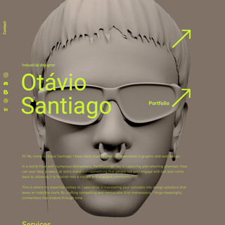
- Otávio Santiago
- Jun 15, 2021
- 1 min read
Updated: Nov 9
The first graphical user interfaces (GUIs), retro graphical user interface design, appeared on computer screens in the early 1970s, transforming not just how we interacted with machines but how we perceived digital space itself. Their visual language — from windowed layouts to pixelated icons — made such an enduring impact that modern operating systems still echo their core principles today.

What began as a revolutionary step in computing became a defining aesthetic moment in design history. Those early interfaces, with their simple grids, low-resolution typography, and limited color palettes, introduced a form of functional minimalism that continues to guide digital design. Even as technology has advanced with smoother gradients and high-definition screens, much of what we see today — dropdown menus, file icons, scroll bars — can trace its DNA back to those early GUI experiments.
Now, as these early systems drift into nostalgia, they’ve found a second life as a source of creative inspiration. Designers are embracing retro-computer aesthetics, not merely for irony or nostalgia, but to evoke a sense of authenticity and emotional connection. The pixelated buttons and monochrome windows of the past remind us of a time when computing felt tangible, exploratory, and full of wonder.
From branding and motion design to digital art and UX, the influence of early GUIs is unmistakable. They continue to inspire a generation of creators eager to blend technological history with contemporary design, bridging eras through form, texture, and memory.
Please, to access the full article visit Creative Market


Comments